CASE STUDY
Kenny Retire financial education
MFA thesis project
Problem statement
The number one request of 401(k) plan participants is to learn more about “how to plan for retirement based on my age and situation.”
- 68% find saving for retirement is harder than expected.
- 72% say they should have started saving earlier, yet 55% plan to save later to make up for not saving now.
- 42% of middle-class Americans say it’s impossible to pay their bills and save for retirement or other financial needs.
- Saving for retirement ranked 4th biggest financial priority. (2014 Wells Fargo Middle-Class Retirement Study.)
Each year financial companies develop offerings that a plan sponsor can use to help their employees learn more about their retirement plans. The employees that have these retirement plans struggle to understand how they work. Communications to the employees or “plan participants” is often very full of long and complicated legal language.
Digital solutions have not been used frequently with retirement plan providers communicating to their participants, but is beginning to happen more today. When the providers do use digital solutions, it is often only articles that are by written by category. What is missing is a wholistic view of learning to plan for retirement throughout life.
Solution
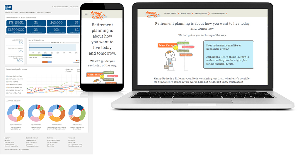
A fictional bank, True North Bank, produces an educational microsite, Kenny Retire, which hooks the user with its approachable style of presenting education about planning for retirement. Kenny Retire persuades retirement plan participants to be proactive with planning for their retirement, while covering four primary topics which include enrollment, asset allocation, increasing contribution, and nearing retirement.
This microsite has a dedicated domain name of kennyretire.com and ties to the fictional True North Bank website (created as prototype screens).
Technical skill areas
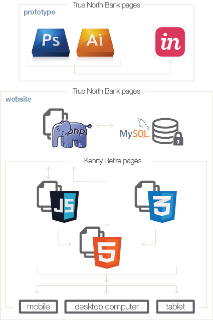
Kenny Retire is a thesis project for the completion of a Master of Fine Arts degree at the Academy of Art University San Francisco. My major was Web Design and Interactive Media with a focus in UX Design.
I created all aspects of this project, including UX design, writing, visual design, development, motion graphics, and graphic design for supporting materials. Illustrations were purchased and then modified in Illustrator to fit my needs.
This project was developed over the course of two years while learning the technical skills to create it. This story contains glimpses into that journey.
Throughout the project, I used the following technologies:
- InVision
- Axure
- Illustrator
- Photoshop
- InDesign
- After Effects
- Audition
- HTML
- CSS
- JavaScript
- SurveyMonkey
- UsabilityHub
Competitive research
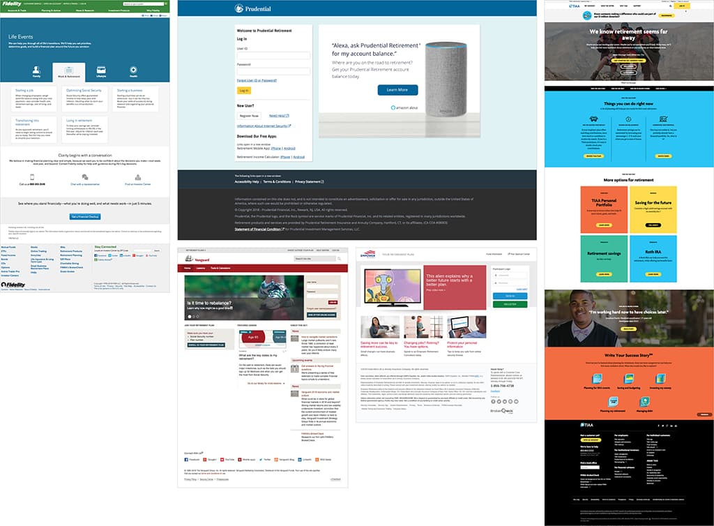
Leading competitors in the retirement plan sponsor financial space:
- Fidelity
- Prudential
- Empower
- Vanguard
- TIAA
Images show how each company approaches education of their plan participants. The large majority use articles by category as their primary educational tool. What I found was missing is a wholistic view of the retirement planning process.
Information architecture
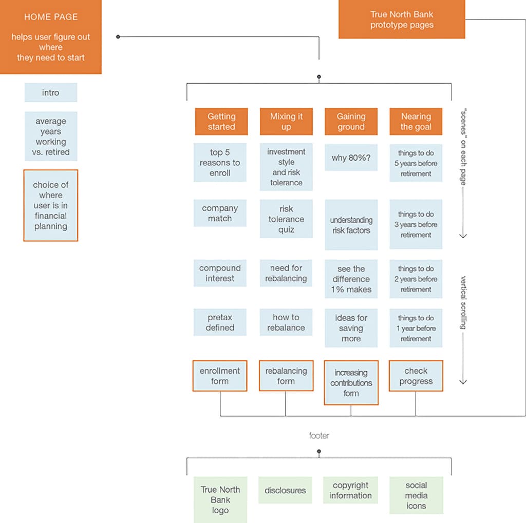
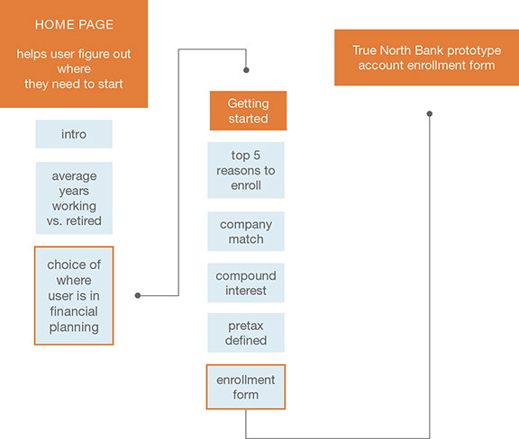
The sitemap for Kenny Retire also shows how the prototype pages of True North Bank are intertwined with the user journey.
Sketches
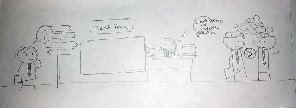
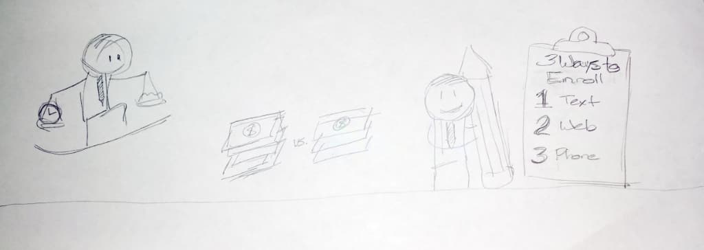
Kenny Retires sketches.
This project started with the intention of using horizontal parallax scrolling. Through sketching the ideas, I discovered that this was not going to work well for the intended content and shifted to a vertical layout.
Wireframes
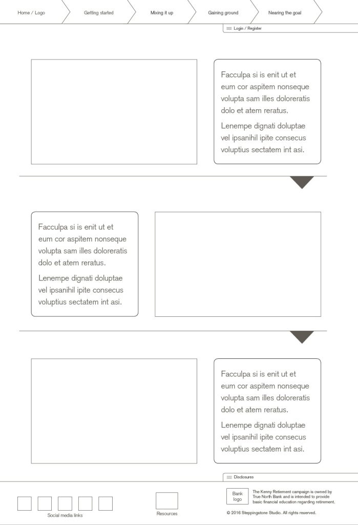
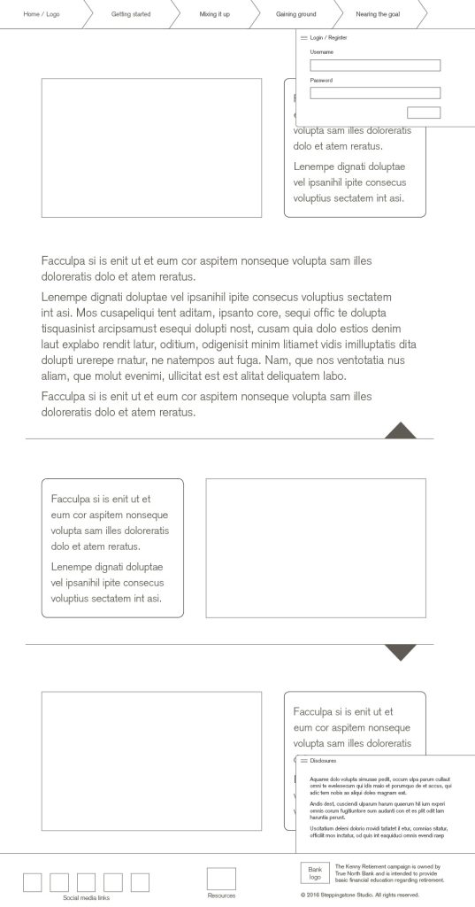
Kenny Retires wireframes.
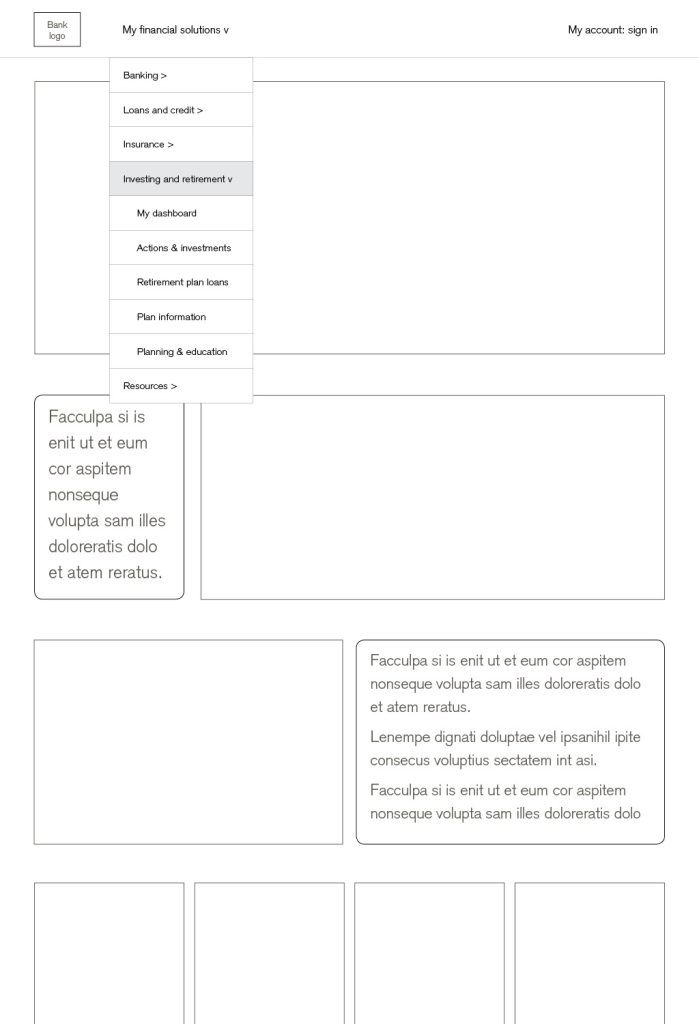
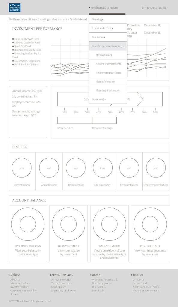
Regular user testing helped me understand which parts of the design needed more clarity.
True North Bank Wireframes
Mockups
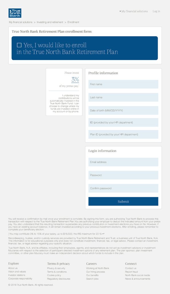
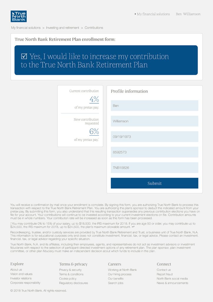
Kenny Retires wireframes.
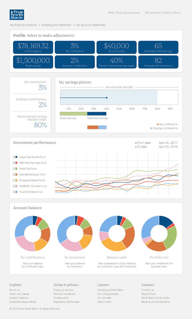
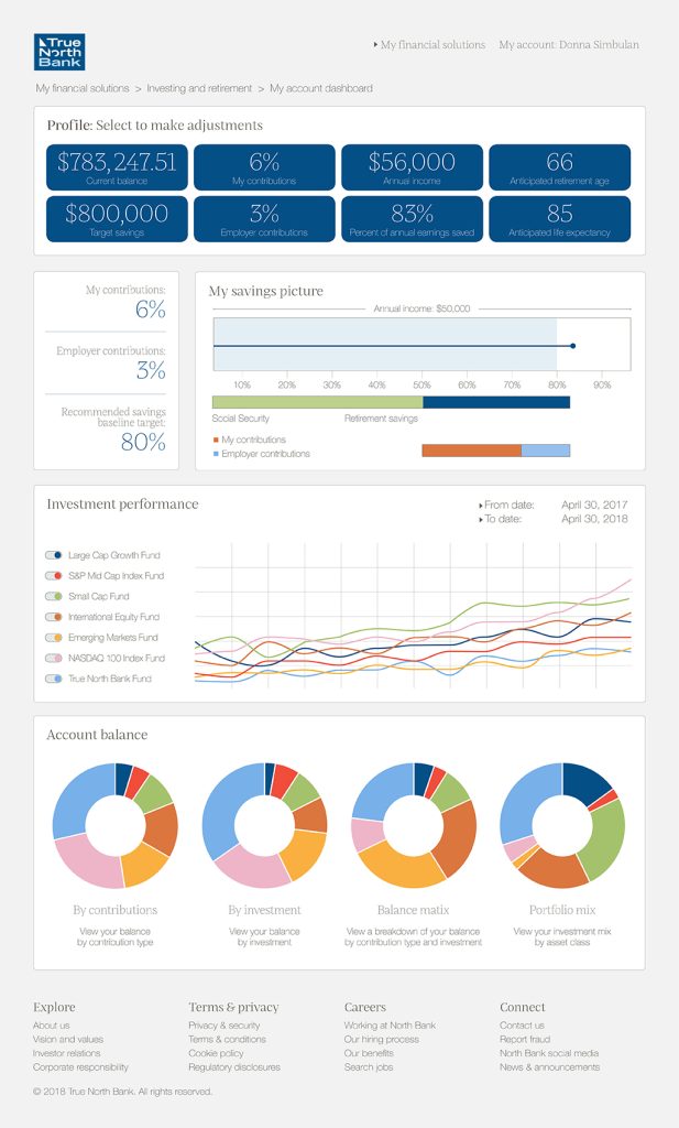
Kenny Retire is an educational tool that supports the user in learning about retirement. For that reason, there are questions at the bottom of each page of kennyretire.com. Some of the choices in these questions lead to prototype pages of True North Bank where they can make changes in their actual retirement account.
User flow example: Kaitlyn
Kaitlyn just graduated from college and is working at her first professional job. She wants to get started with saving in her 401(k) plan but has been putting it off because she is worried about paying for student loans. She receives an email with a video about a funny character trying to save for retirement and clicks on the link to the website.
Kaitlyn finds a website with a character named Kenny Retire. She reads through the Home page and when she gets to the bottom of the page, selects the “not enrolled” option. This takes Kaitlyn to the Getting started page. She takes a minute to read about the top 5 reasons to enroll. When she finds the information related to the compound interest infographic, she understands why it makes a lot of sense to start right away.
Kaitlyn looks around the page a little more and finds information that shows her what effect taking the money out “pretax” would have on her paycheck. She reasons that doing something small at this point is better than nothing, and along with receiving the gift of a company match, she cannot pass it up. She clicks on the link to the enrollment form to enroll.

Early usability research and testing
Using Lean Agile practices in order to get early feedback, I used a low fidelity prototype for the first round of testing which focused on:
- Audience validation
- Task scenarios
- User interface structure
- Navigation
This test consisted of 17 questions and two user task scenarios. Results were sorted into UX heuristic categories to look for patterns.
This round of testing helped me to validate the audience and their interest in the topic. This helped me understand that this work is probably best for the lower end of the middle class income range.
There was some confusion when asked about the purpose of the site.
The feedback led to redesigning the user interface to streamline the message and visual content. A disclosures tab was removed because it was often not discovered and unexpected in the way that it worked.
Later usability research and testing
One of my later rounds of testing focused on: purpose of the site.
Having encountered problems in this area in an early round of testing, I needed to go back and confirm that the change in direction was working. Using usabilityhub.com, this test was done to focus on being sure that the site’s purpose was fully understood at a quick glance. Users were given 5 seconds to view an image and then explain what they thought the purpose of the site is.
27 out of 30 people described the site in terms of retirement or financial planning in some way. Even though I felt that these were strong results, I added the headline and subheading at the top of the home page to be sure the user didn’t have to figure out the intention.
Successes
Challenges
I was challenged technically by learning how to use Bootstrap and write JavaScript. Development work is something that I find challenging and not something I want to do for a living, however, I also enjoy proving that I am able to pull it off.
I also learned a lot about developing a stronger UX process through this work. I now spend a lot more time in wireframes and research, determining the problems I am trying to focus on and solving them in these early stages. This project taught me that UX is so much more about solving problems and strategy, not visual design.