CASE STUDY
Serving customers faster in healthcare call center at LabCorp
Cost-saving mission
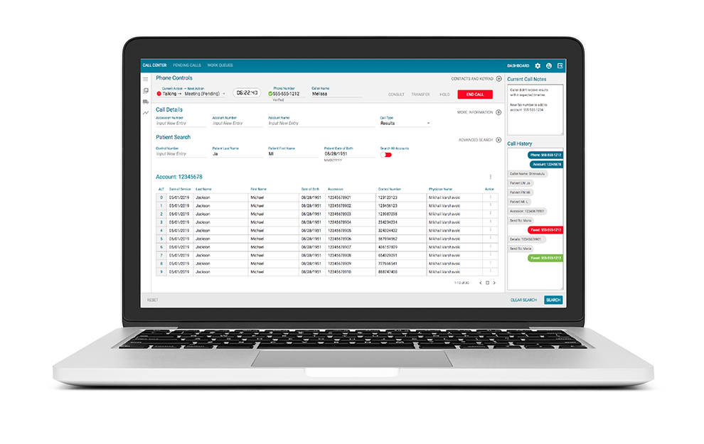
Bringing speed and efficiency to the call centers at LabCorp was planned to be the largest cost-savings project in 2018. Looking at the call centers that handled calls from healthcare providers about patient’s labs, the leaders saw a large opportunity. The software that the call centers used was dated. The plan was to update the call center software while adding IVR as well as update the self-service website.
By focusing on the largest volume of calls and biggest pain points, we hoped to gain momentum and buy in for this project quickly. We knew that 53% of the calls that came in were for those requesting patient test results. We knew that the average hold time for the caller was 90 seconds. If the test was not found and was part of the specialty labs, they had to be transferred and start the hold time again.
My role
The UX team for internal products was composed of my manager, a UX Architect, and myself, a Senior UX Designer. He was involved in getting the project off the ground and leading the big picture decisions, as well as collaborating with me. I was involved in the day to day strategy for user flows, user research and representing UX in the weekly leadership meetings. Eventually, I was the only UX person on the project for the last nine months in this job.
Eight weeks to MVP
Given eight weeks to get a new call center application up and running with two call types, I could see that the design we had for the Results call type would not meet the needs of our users. The users, Customer Service Reps or CSRs, needed to be able to verify the test name and its status in this screen before faxing the results.
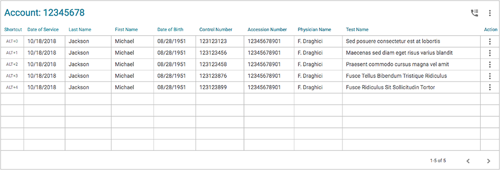
Our current custom grid system did not work for this need. There can be as many as 75 test names in one lab order and the names are very long. That simply wouldn’t fit in the same row in a grid with all the other information that they needed.
However, we had a timeline and “MVP” was the rallying cry. In order to get the product up and running, I gave them our simple data grid, knowing that the test names were too long for the column. Providing a design for today, while working on the design for tomorrow kept the project moving.
Goals
The business goals on this project were to create higher efficiencies including getting through calls more quickly, while still providing the accuracy necessary in the medical field. The CSRs were highly motivated to finish calls quickly as well because every review and potential pay raise was based on this.
User flow
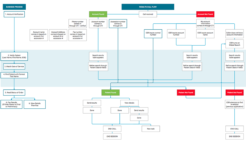
The users have a specific set of steps to verify the client calling. These steps are to verify their account, then verify the patient, the date of service and lastly, the name of the test they are looking for and its status.
Validating the MVP
Knowing that an MVP is all about learning, we needed to spend time with the users in our pilot office of Tampa. Watching them use the application, the step of verifying the test name with the correct patient was getting in the way of the business goals and the user goals.
The user could not verify if the patient that they were searching for was the one who had taken that particular test without first selecting the fly-out menu, choosing View Details, and then waiting for the Details screen to load. Then the CSR would scour through the details trying to find the test that the user was calling about, and if it was not the correct test result, go back to the search results, and begin the process again, losing 30-45 seconds each time.
I knew from observing the users with our system, as it was built for today, that if we could find a way to let the users see and search the test names and see the status of each test, that we would cut off a tremendous amount of time on each Results call.
I had conversations with our developers about showing the status of each order and each test and result type within each test in this grid. Because this is a Patient Search screen potentially returning millions of results, they were not willing to provide this information at this point.
Expanding the design system
Researching many data grid systems, I was inspired by an article that showed a Quick View pane. Working with my team, we enhanced our data grid options to include this kind of functionality in our design system. Working with our developers, we asked that this be designed as an open panel so it could be customized easily for different needs within our applications.
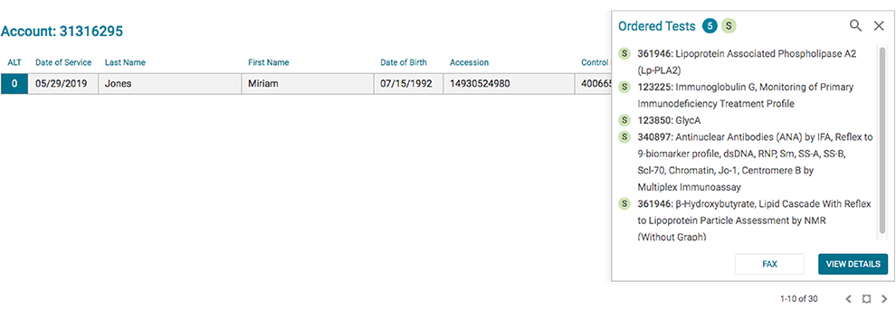
I included in this design, the ability to see the entire list of test names in each order, scrolling if needed, searching and narrowing down the list of test names, while also viewing the status of the order and each test.
In this design, the user is selecting one row. The Quick View pane then opens with the test names and statuses. It is a lighter load to be able to pull only one accession so they can make that final confirmation step (verifying the test name(s) and status) in order to fax the results. The developers were more than willing to work with this solution, and once developed, the users brought their call times down significantly. We found that the users were able to use the Details screen intentionally. Instead of opening the Details to read something they couldn’t view properly in the previous screen, they opened it only when they needed to see the additional details in an order.
Obtaining stakeholder agreement
In the process of solving the needs of the Details screens, designs were presented in leadership meetings that involved the CIO and his C-suite team. There were differing opinions on whether or not to move forward with the development of my design. There was a link to the PDF of the results in the current day and future solutions. The PDF is what is faxed to the healthcare provider when requested. The leaders suggested showing only that PDF, instead of the Details screen. I was able to back up the argument for my future design by showing that there is information that the CSRs need, that is not permitted to be shown in the results PDF.
In order to solve this debate, I conducted some additional usability testing to determine which design; current day, my future design, or the PDF, would work best for the users. I did this testing in the Tampa office, giving the users a series of tasks in each of the three options; current application design, my interactive Axure mockup, and a version with only the PDF.
I tracked the time to complete each task and asked for qualitative feedback at the end in order to be sure that we didn’t need a fourth solution. The results led very clearly to using the future design with the ability to search and sort test results.
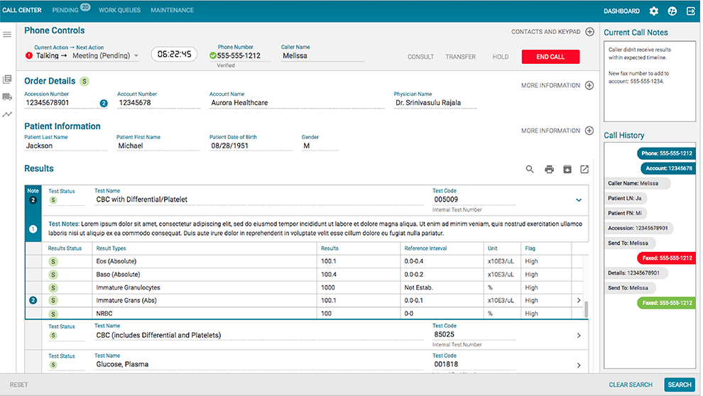
It took several conversations at weekly leadership meetings to get the leadership team in agreement that all avenues had been explored. There was resistance regarding spending more time and money on building the redesign. However, looking at the differences in testing results, with clear quantitative data, we could see that this would add efficiency to the product. At the writing of this case study, the team was moving forward with the development of this design.
What I learned from this experience with the leadership team is that I didn’t know what was really holding the design decisions back. Were they concerned that the new design might fail? Were they worried that I had missed something and didn’t trust my solution? Was this purely a budget issue?
I was working under the assumption that an MVP led to learning and then iteratively improving the design. Perhaps that is not what MVP meant to everyone in these meetings. If I had it to do over again, I would find a way to have those conversations. I would want to hear from the team what their expectations were regarding learning from our early attempts. I would want to know what they thought the worst and best case scenarios could be with this particular solution. This kind of transparent conversation would have had the potential to move this process along faster.